Young Design
  • Work
  • About Us
  • Services
  • Clients
  • Blog
  • Contact
  • Menu Menu
  • Link to LinkedIn
  • Link to X
  • Link to Pinterest

Designing with Blue

Branding, Email Marketing, Graphic Design, Print Design, Web Design

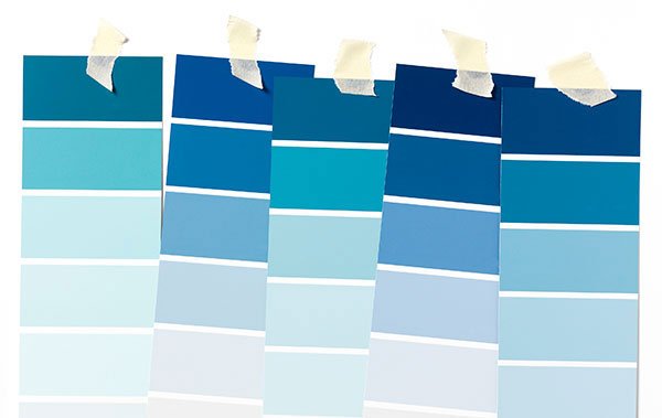
Ever noticed there are a lot of blue logos out there? Blue is one of the most popular colors used in corporate branding, and no wonder: in marketing, the color blue conveys safety and stability, engendering customer trust. You’ll see technology, banking, automotive and health industries using blue in their brands.

Let’s look at the positives and negatives of using blue for your brand:

POSITIVES

  • Because we’re surrounded by blue in nature (the sky, water) – blue is calming and familiar. It also conveys a certain seriousness in business.
  • While you’ll compete with other blue-branded companies, the close association will also gain you credibility.
  • You’ll have your pick from a huge variety of blues. Think teal, aqua, navy, royal, sky blue – the options are endless.
  • Blue pairs beautifully with oranges and greens.

NEGATIVES

  • Blue can come across as cold and unfeeling.
  • Avoid using blue for food products, as blue is rare in natural foods.
  • Some tones of blue ink do not dry completely when printed (we’re looking at you, Reflex Blue), so that on printed pieces it can actually rub off or scuff.
  • If you want a blue logo, find a complementary warm or hot color to use with it in marketing materials; it will give the blue even more emphasis.
February 24, 2026
Share this entry
  • Share on Facebook
  • Share on X
  • Share on WhatsApp
  • Share on Pinterest
  • Share on LinkedIn
  • Share on Reddit
  • Share by Mail
https://www.youngdesign.com/wp-content/uploads/design-with-blue-x600.jpg 379 600 Julie Young https://www.youngdesign.com/wp-content/uploads/young-design-logo-1.png Julie Young2026-02-24 17:32:132026-02-24 17:32:13Designing with Blue
You might also like
don't make these branding mistakes headline against red background Correct These Common Branding Mistakes
example of icons A Guide to Using Icons in Your Marketing Materials
man in a suit holding name tag What’s Your Company’s Name?
A Few Words About Word
presentation design 5 Tips for an Easier Slide Deck
email campaign design Tips for Planning Your Holiday Email Campaign
Search Search

Recent Posts

  • Don’t Fall for Cookie-Cutter Branding
  • Guest Post: How to Get Attention for Your Online Content
  • Designing with Blue
  • PRINT: Stayin’ Alive
  • FAQs: Answering Your Design and Marketing Questions

Categories

  • Branding
  • Email Marketing
  • Graphic Design
  • Print Design
  • Web Design
  • Web Development

Archives

GET IN TOUCH

Let’s talk:

703-476-5316

EMAIL US:

INFO@YOUNGDESIGN.COM

FOLLOW US:

  • LinkedIn
  • Twitter
  • Pinterest
  • Work
  • About Us
  • Services
  • Clients
  • Blog
  • Site Map
©2026 YOUNG DESIGN. ALL RIGHTS RESERVED.
  • PRIVACY POLICY
Link to: PRINT: Stayin’ Alive Link to: PRINT: Stayin’ Alive PRINT: Stayin’ Aliveprint stayin' aliveLink to: Guest Post: How to Get Attention for Your Online Content Link to: Guest Post: How to Get Attention for Your Online Content Man holding lightbulbGuest Post: How to Get Attention for Your Online Content
Scroll to top Scroll to top Scroll to top